@Rodolfo , for what it's worth – as somebody who's here for the same reason – "Main problem here is that you assume" isn't really how good UX works. The
main problem here is that the path isn't as obvious as you feel it is.
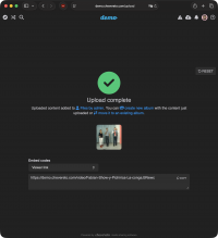
For example, I missed that there was an option to create an album when the upload completed.
Is the option there? Yep. Is it well designed as a CTA? Debatable, but depending on how open you are to alternative views, you might insist that it is.
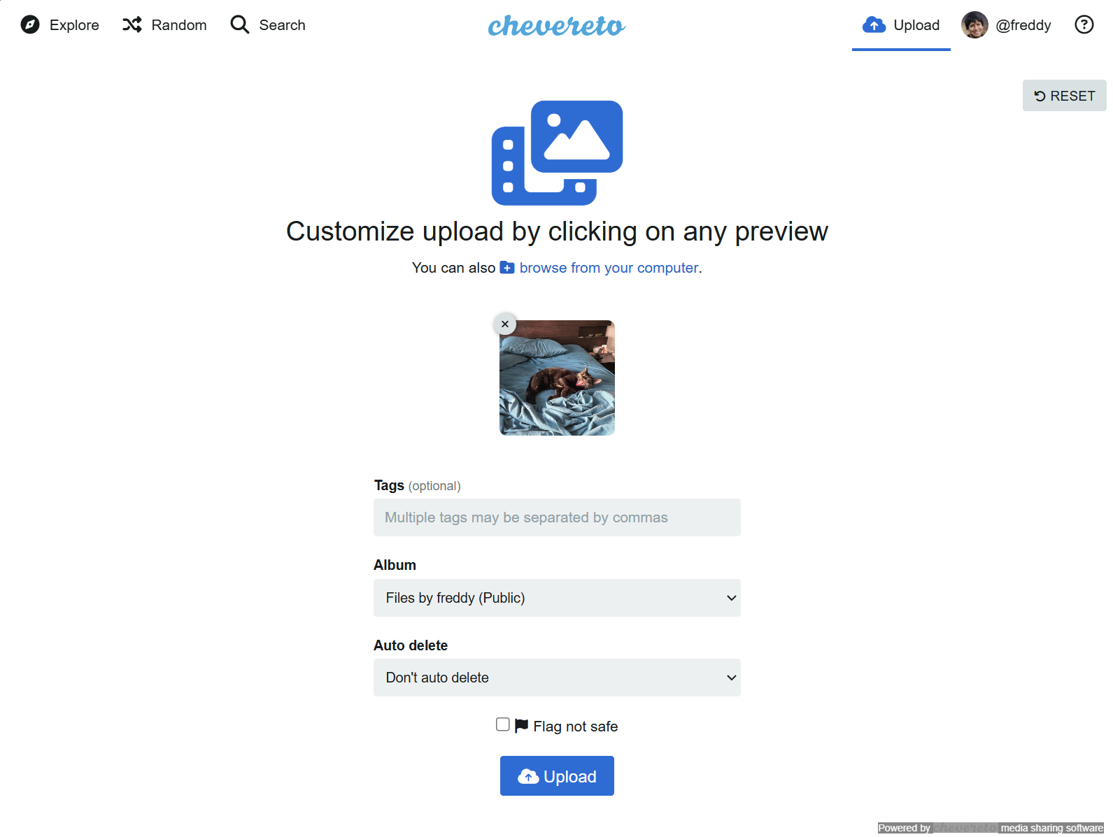
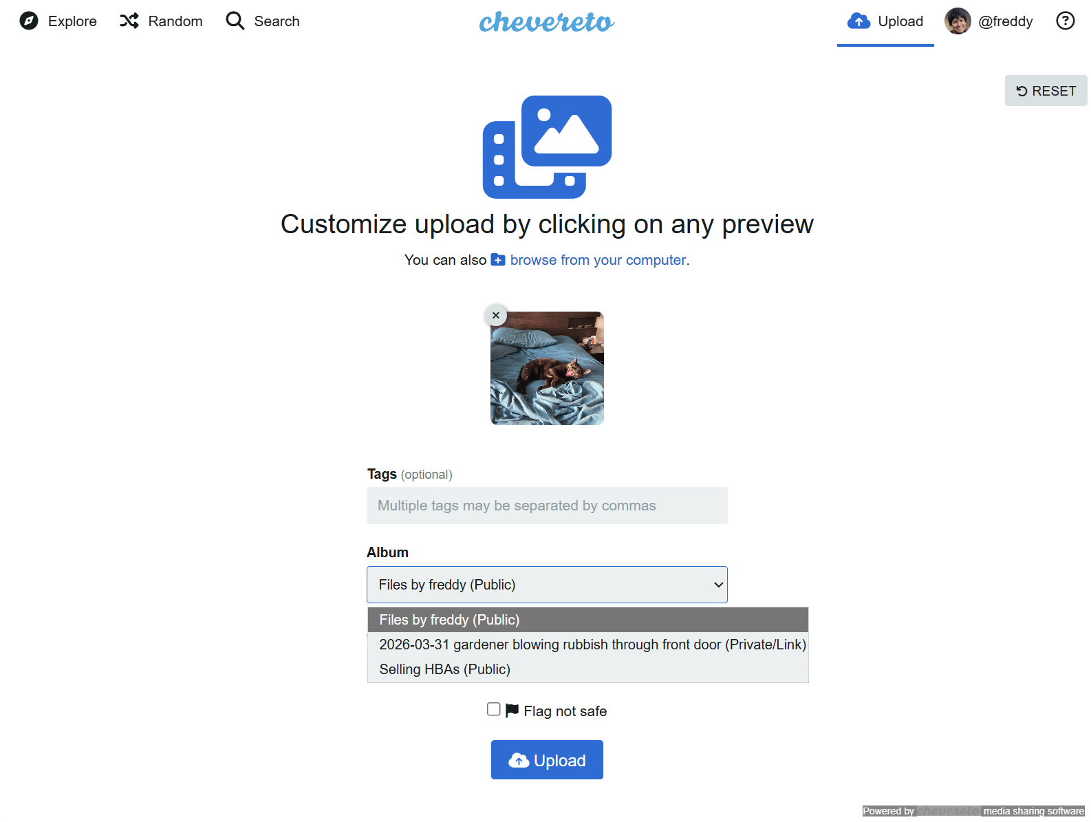
Having missed it, I then became frustrated that I couldn't find the option in any other obvious location. Yes, I'm saying your other bullet points don't stand out as obvious locations for the option. Handy that it can be done there, for sure, but a touch ridiculous that it can't be done from, say,
the albums page. "There's nothing to show here" is what we get, and it didn't occur to anybody (and apparently not again since 2017) that it might make sense to add a function or two to this page if it's not populated.
The actions menu on the Files screen is another obvious place that should host "move to album" and "create new album with selected files" options. As for now, the only option in there is "delete". Why have a menu at all?
Anyway, thanks for the answer that got me where I needed to be. I'd only ask that you not ascribe problems to the user. Solutions come from studying natural user behaviour. Desire paths, for example.


