Hey there,
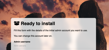
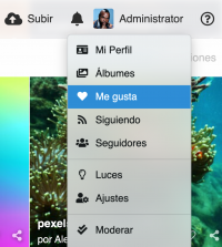
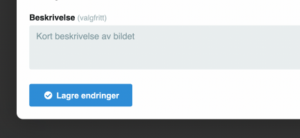
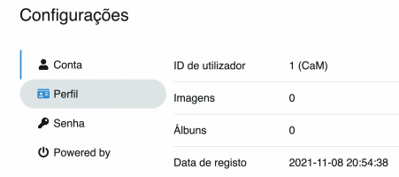
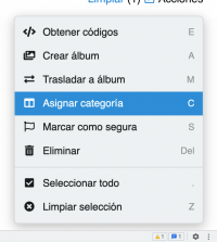
Release V4.0.0.beta.3 fixes many of the bugs and errors affecting its predecessor and provides a significative upgrade in the user interface with the addition of palettes and a massive pack of ui improvements.
🐛 Fixed bugs
This release fixes the issues with
🤑 User interface upgrade
After releasing V4 beta we got a lot of questions about user interface upgrades and to my surprise many users aren't into upgrading at all unless the user interface gets any change. We didn't plan any user interface upgrade until V4.3. We are greedy, we tweaked the schedule and we will add the theme upgrade, starting in V4.0.0.beta.3.
💅 Refined UI
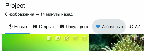
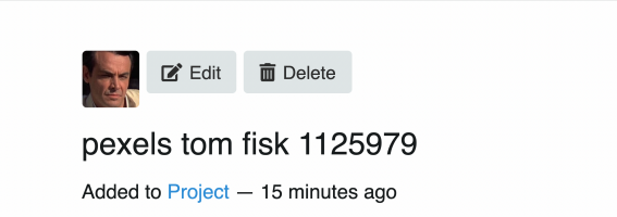
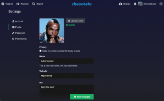
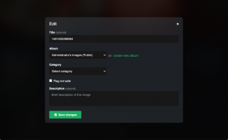
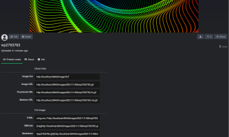
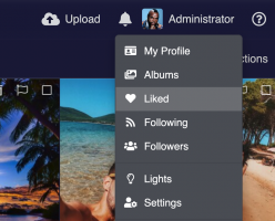
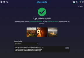
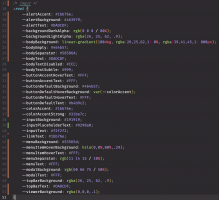
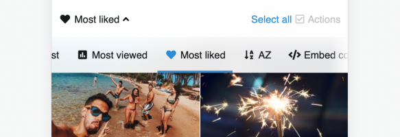
The default theme, Peafowl, looks better than ever as it now gets a consistent color palette as it delivers lower noise to your content delivery experience.
(The user interface changes are massive, I will disclose each change in a new post).
😘 When?
I'm targeting the end of the month as I want to test this beta in a couple of the machines that other users of the software have already donated (thanks!). If you have infra which you want to check how "chevereto-v4-ready" is simply contribute with your donation.
Release V4.0.0.beta.3 fixes many of the bugs and errors affecting its predecessor and provides a significative upgrade in the user interface with the addition of palettes and a massive pack of ui improvements.
🐛 Fixed bugs
This release fixes the issues with
ca-certs, the database oddities when installing, and the issues with the implementation of env variables. It also implements the fixes described in V3.20.15.🤑 User interface upgrade
After releasing V4 beta we got a lot of questions about user interface upgrades and to my surprise many users aren't into upgrading at all unless the user interface gets any change. We didn't plan any user interface upgrade until V4.3. We are greedy, we tweaked the schedule and we will add the theme upgrade, starting in V4.0.0.beta.3.
💅 Refined UI
The default theme, Peafowl, looks better than ever as it now gets a consistent color palette as it delivers lower noise to your content delivery experience.
(The user interface changes are massive, I will disclose each change in a new post).
😘 When?
I'm targeting the end of the month as I want to test this beta in a couple of the machines that other users of the software have already donated (thanks!). If you have infra which you want to check how "chevereto-v4-ready" is simply contribute with your donation.

