💡Describe your Feature request
At the moment, all pictures, albums and users are displayed in the dashboard as rather large tiles. Although, it seems to me, it would be more convenient for the administrator to perceive this information in a more compact form. For example a list with small previews or a small grid. The point is to guard as many images as possible instead of endlessly scrolling through pages.
👏Where did you saw this?
Such a function can of course be seen in any operating system, such as windows. I also saw similar in reservo, they have the ability to see a demo. Here are some screenshots:
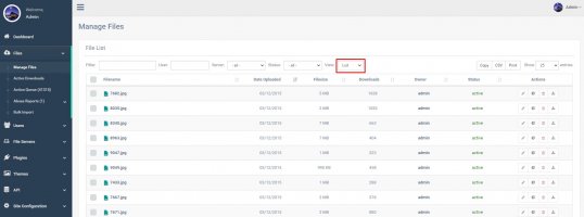
View files as a list. To the left of the file name you can make a small thumbnail, for example 60x60 pixels, which will be enough to roughly understand what is there and if you need to open the full size.
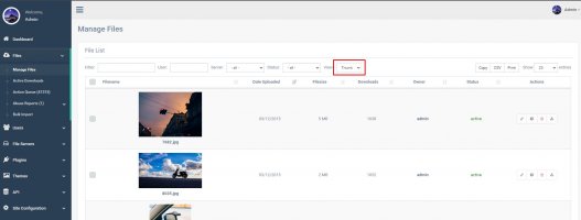
View files as thumbnails. It looks like a list, you can reduce the thumbnails and it will be more compact.
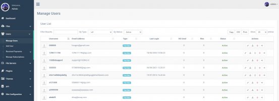
View a list of users. Here I think everything is quite perfect.
The essence of this proposal is to make administration more convenient. The administrator does not need to see big beautiful pictures in the form of tiles, the users need it. The administrator needs a convenient control panel that contains as much useful information as possible.
Of course I suggest adding this as an option so that those who like the current version can use it.
🔥Interest outside our community
-
At the moment, all pictures, albums and users are displayed in the dashboard as rather large tiles. Although, it seems to me, it would be more convenient for the administrator to perceive this information in a more compact form. For example a list with small previews or a small grid. The point is to guard as many images as possible instead of endlessly scrolling through pages.
👏Where did you saw this?
Such a function can of course be seen in any operating system, such as windows. I also saw similar in reservo, they have the ability to see a demo. Here are some screenshots:
View files as a list. To the left of the file name you can make a small thumbnail, for example 60x60 pixels, which will be enough to roughly understand what is there and if you need to open the full size.

View files as thumbnails. It looks like a list, you can reduce the thumbnails and it will be more compact.

View a list of users. Here I think everything is quite perfect.

The essence of this proposal is to make administration more convenient. The administrator does not need to see big beautiful pictures in the form of tiles, the users need it. The administrator needs a convenient control panel that contains as much useful information as possible.
Of course I suggest adding this as an option so that those who like the current version can use it.
🔥Interest outside our community
-
